Enterprise AI Platform
Enterprise AI is an internal AI platform used by multiple departments, such as marketing, product, sales, and data teams, each with different needs, from content generation to data analysis and business optimization.My role was to evaluate usability, identify pain points, and propose improvements to help employees work more efficiently while ensuring data security and confidentiality.
My role
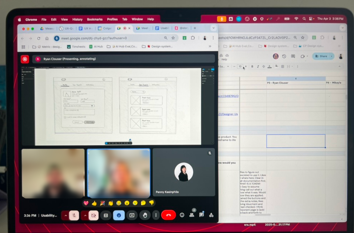
Conducted cognitive walkthrough and heuristic evaluation
Evaluate the current usability, identify pain points, and propose actionable improvements
Analyzed key findings and prioritized by severity score rating
Proposed Visual/mockups recommendations
Team
Penny Kasinphila (Me), UX design intern
Teressa Clark, UX Design Manager
Kevin Justice, Lead UX Designer
Sakshi Sonawani , UX design intern
Duration
Sep 2024 - Jan 2025
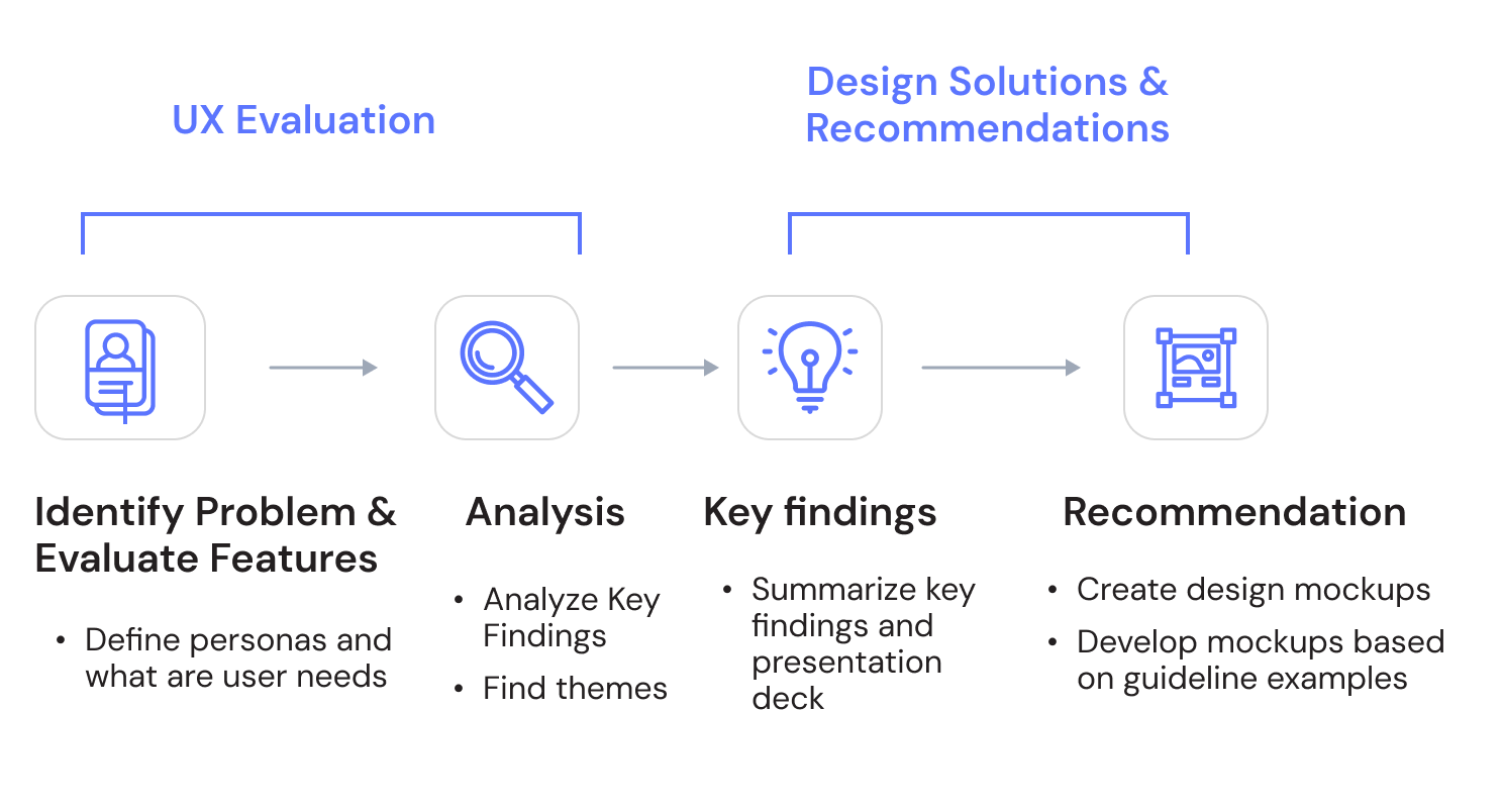
Design Process

User needs
The platform needs to support diverse user needs across departments, helping employees work more efficiently while maintaining data security and confidentiality. The goal is to evaluate Enterprise AI, identify areas for improvement, and ensure it assists users in completing tasks, delivering useful insights, and simplifying daily workflows.

Marketing teams
Generate campaign visuals, copy, and creative content.

Product & Business teams
Analyze reports, visualize data, and extract insights.

Data security & privacy
it’s enterprise software, protecting confidential data assets is critical.

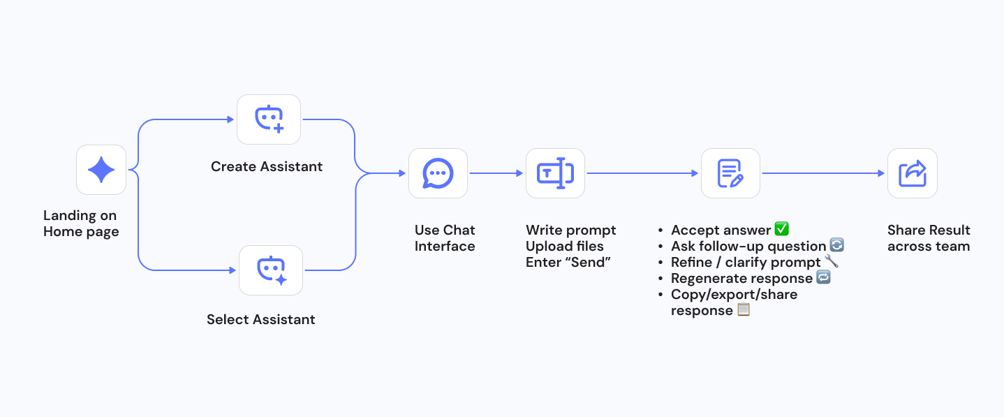
User Journey
Landing on Home Page
Create Assistant or Select Assistant → Configure AI models
Use Chat interface
Share results across teams

UX Evaluation Methods
✦ Cognitive Walkthrough
✦ Heuristic Evaluation
✦ Severity Scoring (0–4 Scale)
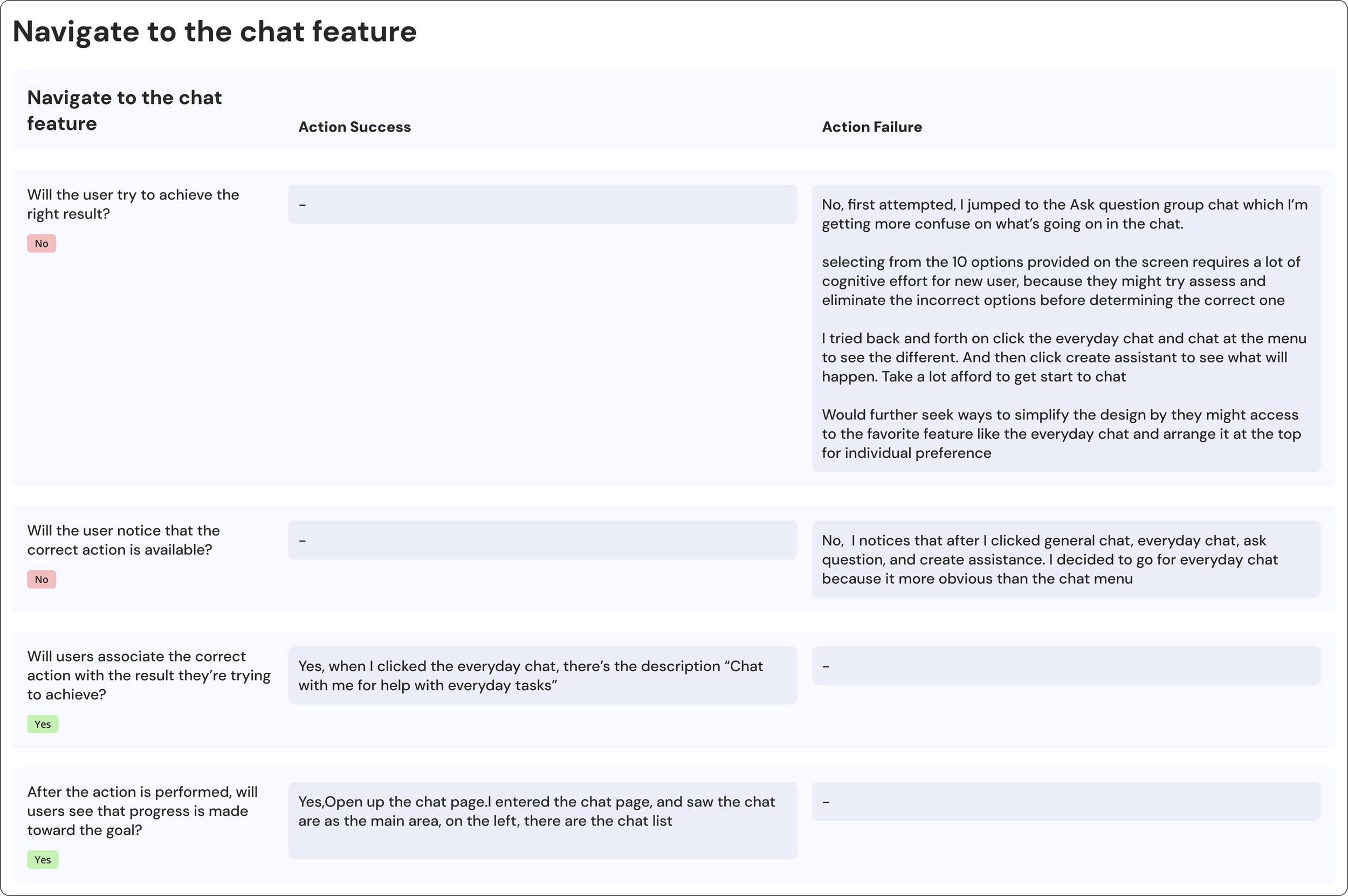
Cognitive Walkthrough
A task-based evaluation method where I walked through typical user flows step-by-step, simulating how a real user would experience the platform. This helped identify interaction pain points, unclear flows, and obstacles that prevent task completion.
An expert review using Nielsen’s 10 Usability Heuristics to assess overall UX quality
Heuristic Evaluation
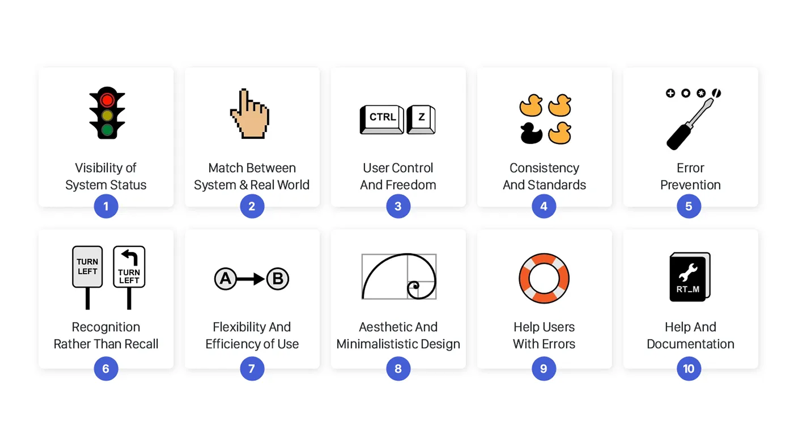
Severity Score
0 - I don’t agree that this is a usability problem at all. Users easily completed the task or liked the experience
1 - Cosmetic problem only: Experience not working or implemented as intended, need not be fixed unless extra time is available on project.
2 - Minor usability problem: Users had only minor issues, or cosmetic, fixing this should be given low priority
3 - Major usability problem: Users could complete the task, but with difficulty, important to fix, so should be given high priority.
4 - Usability Catastrophe: Stopped users, frequent frustration or self-blame, imperative to fix this before product release.
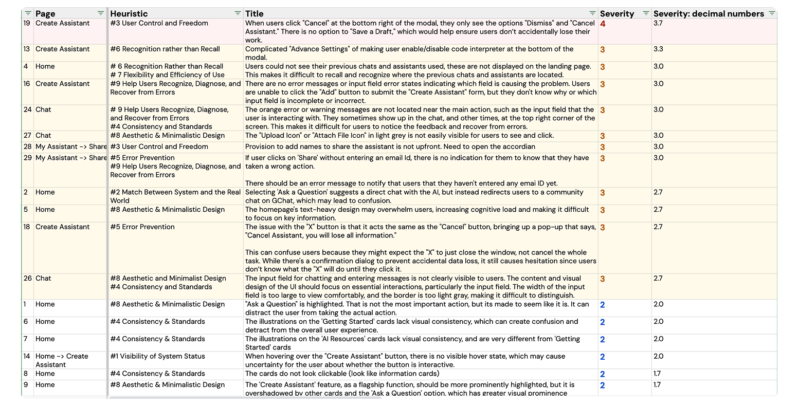
❌ Issues
Home page
Missing quick access to previous chats
#6 Recognition Rather than Recall , #7 Flexibility & Efficiency of Use (Severity 3)
Previous chats and assistants are not shown on the landing page, making it hard for users to locate or resume previous work.
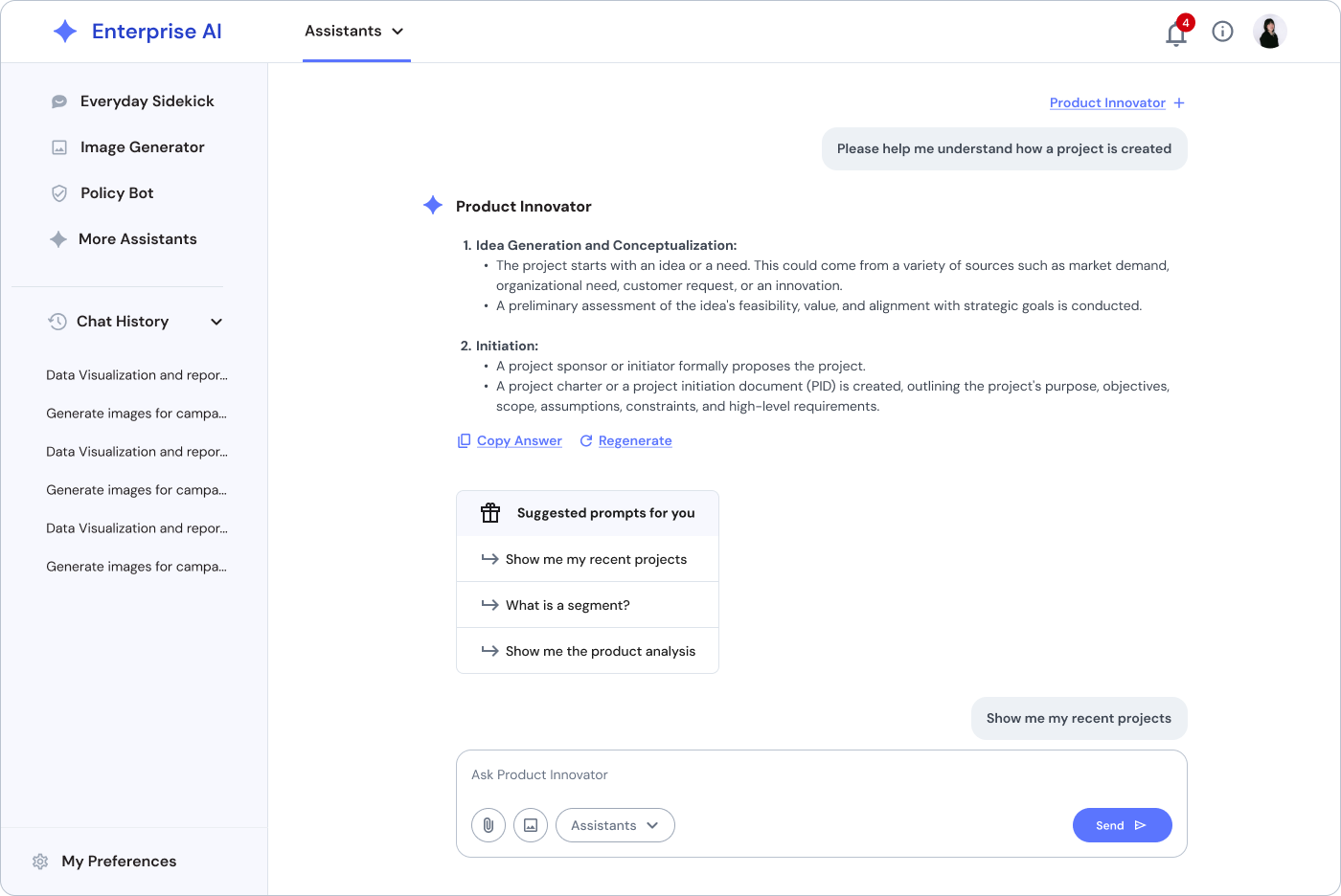
Misleading “Ask a Question” label causes confusion
#2 Match Between System and the Real World (Severity 3)
“Ask a Question” label is misleading; users expect direct AI chat but are redirected to a community chat, causing confusion.
Cluttered homepage
#8 Aesthetic & Minimalist Design (Severity 3)
Text-heavy homepage increases cognitive load, making key information harder to scan and overwhelming for users.
Missing hover feedback on interactive buttons
#1 Visibility of System Status (Severity 2)
No visible hover state on the “Create Assistant” button, causing uncertainty whether it’s clickable or interactive.

✅ Recommendations
Home page : option 1
Support Recognition Rather Than Recall
Surface Recent Activity or My Chats directly on the homepage. Show thumbnails or titles of the most recent sessions with options to resume or manage.
Reduce Cognitive Load & Improve Aesthetic Design
Group related functions into clearer sections with distinct headers.
Use more visual hierarchy (cards, icons, white space) to make content scannable.
Apply progressive disclosure: show high-priority features first, with expandable sections for less-frequent tasks.
✅ Recommendations
Home page : option 2
Consider making the Chat page the default landing experience, since chat is the primary interaction and core user task.
Eliminate the need for users to enter the Home page first, get them directly to where they need to take action.
Secondary tools and resources (e.g., assistants, learning, configuration) can still be accessible via the side navigation or quick-access panel for advanced users.
❌ Issues
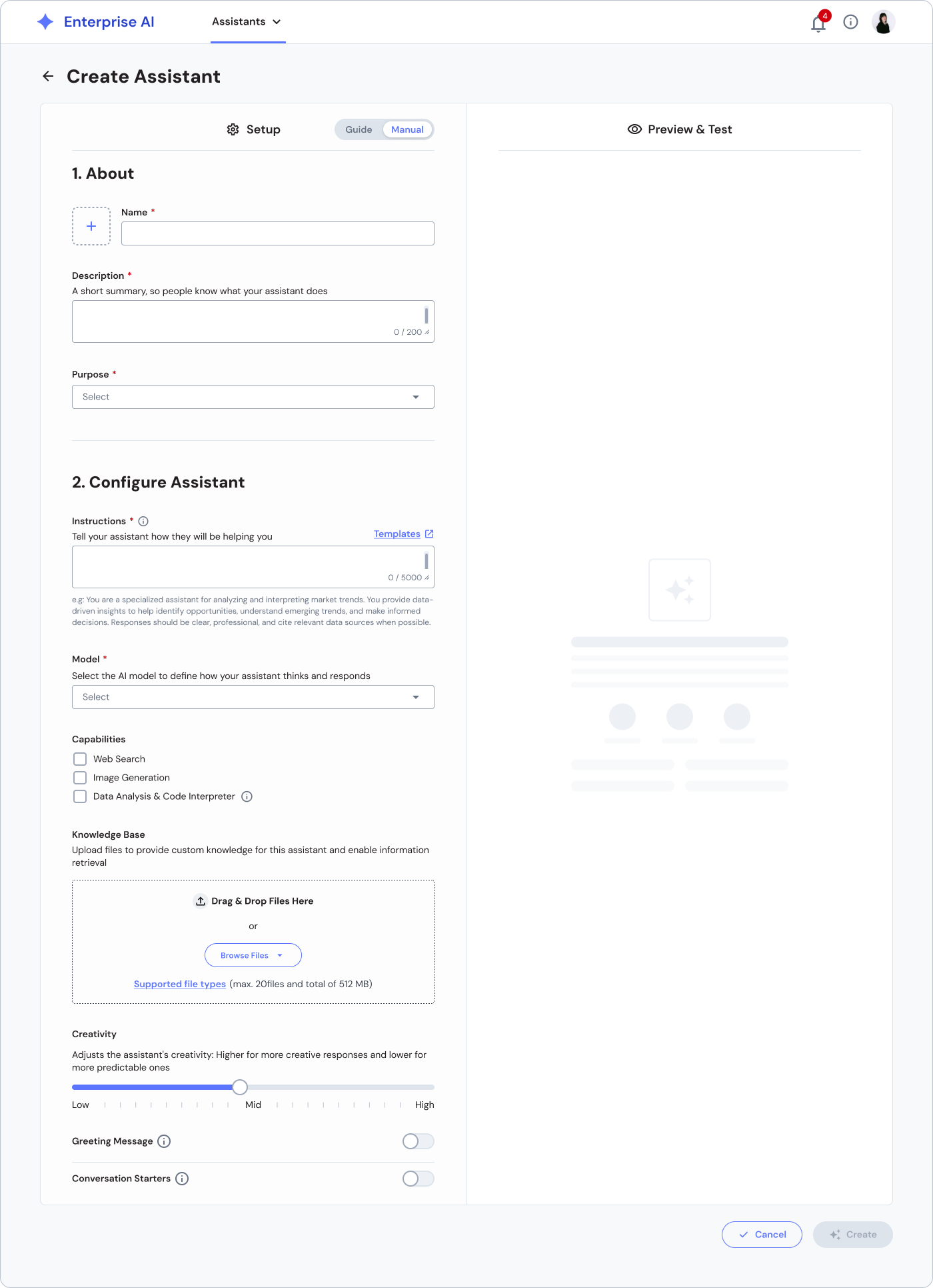
Create Assistant
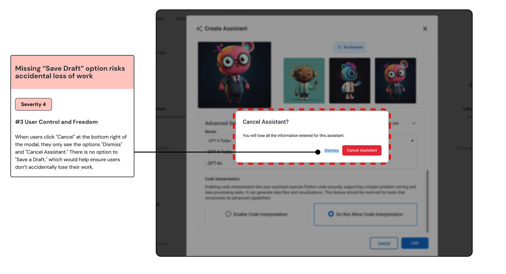
No Save Draft option: Users risk losing work if they cancel, since there’s no way to save progress.
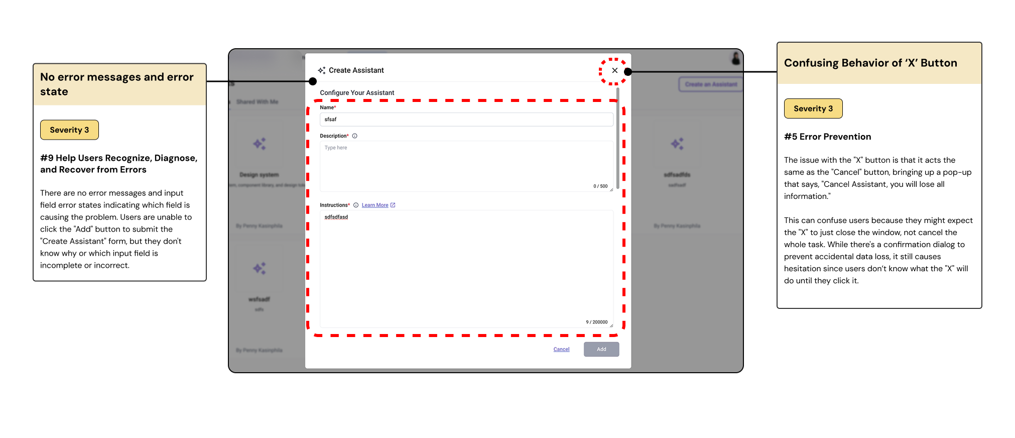
No error message / unclear error state: Users don’t know which fields are incomplete or causing submission issues.
Confusing X button behavior: The “X” button behaves like cancel, risking accidental data loss.
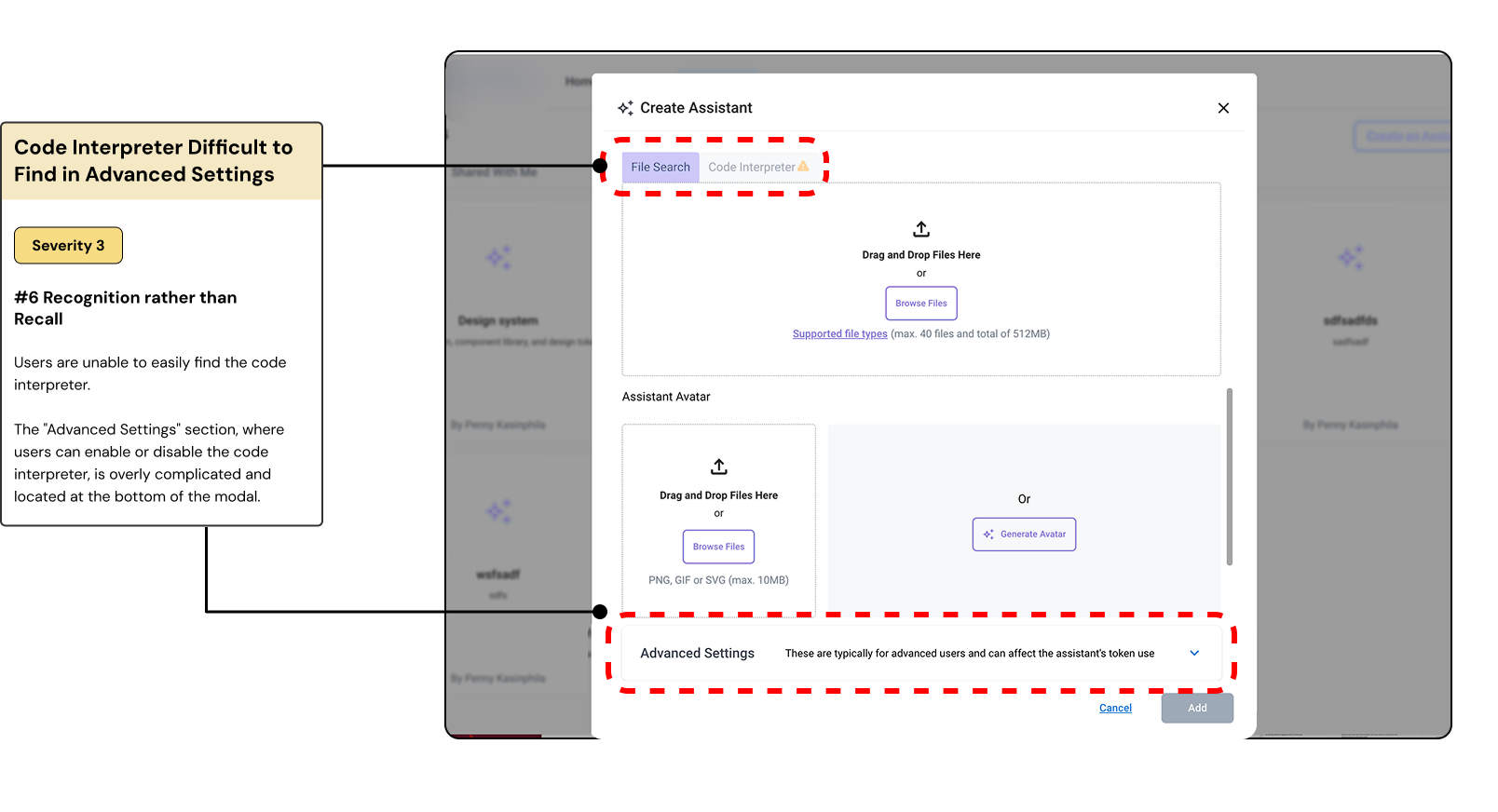
Code Interpreter hard to find: Code Interpreter settings are buried under Advanced Settings, making it difficult to locate.
✅ Recommendations
Create Assistant
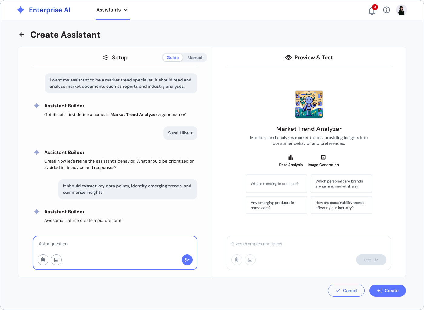
Switch from Modal to Full Page Layout
Replace the current modal pop-up with a dedicated full-page interface. This allows more space for users to comfortably view and manage all input fields without feeling overwhelmed or restricted by a limited modal window.
Divide into Two Clear Sections
Setup Panel (Left)
Users can enter assistant details such as name, description, purpose, instructions, model selection, capabilities, knowledge base files, and personalization settings.
Preview & Test Panel (Right)
As users input their assistant’s configuration, they can immediately preview and interact with the assistant to validate if it works as intended before finalizing.
❌ Issues
Chat page
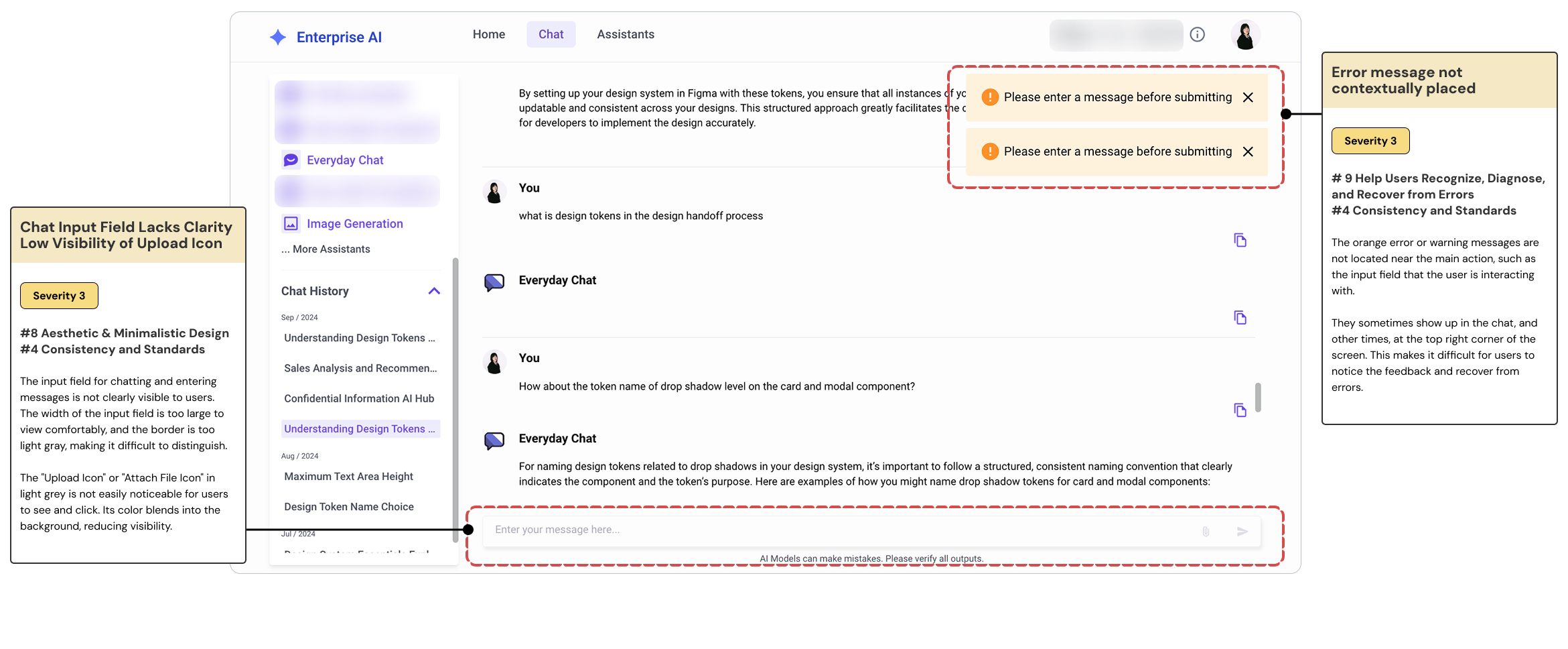
Chat input field is visually unclear (small width, light border makes it hard to distinguish).
Upload icon is low visibility (light gray blends into background).
Error messages appear far from the input field, causing confusion.
Inconsistent error placement makes it hard for users to identify and recover from errors.
✅ Recommendations
Chat Page
Contextual Placement of Error Messages:Ensure that error messages are displayed near the actions that triggered them.
Increase Visibility of Upload Icon and Input Field : Ensure the chat input field is clearly distinguishable with a visible border and appropriate size for comfortable viewing.
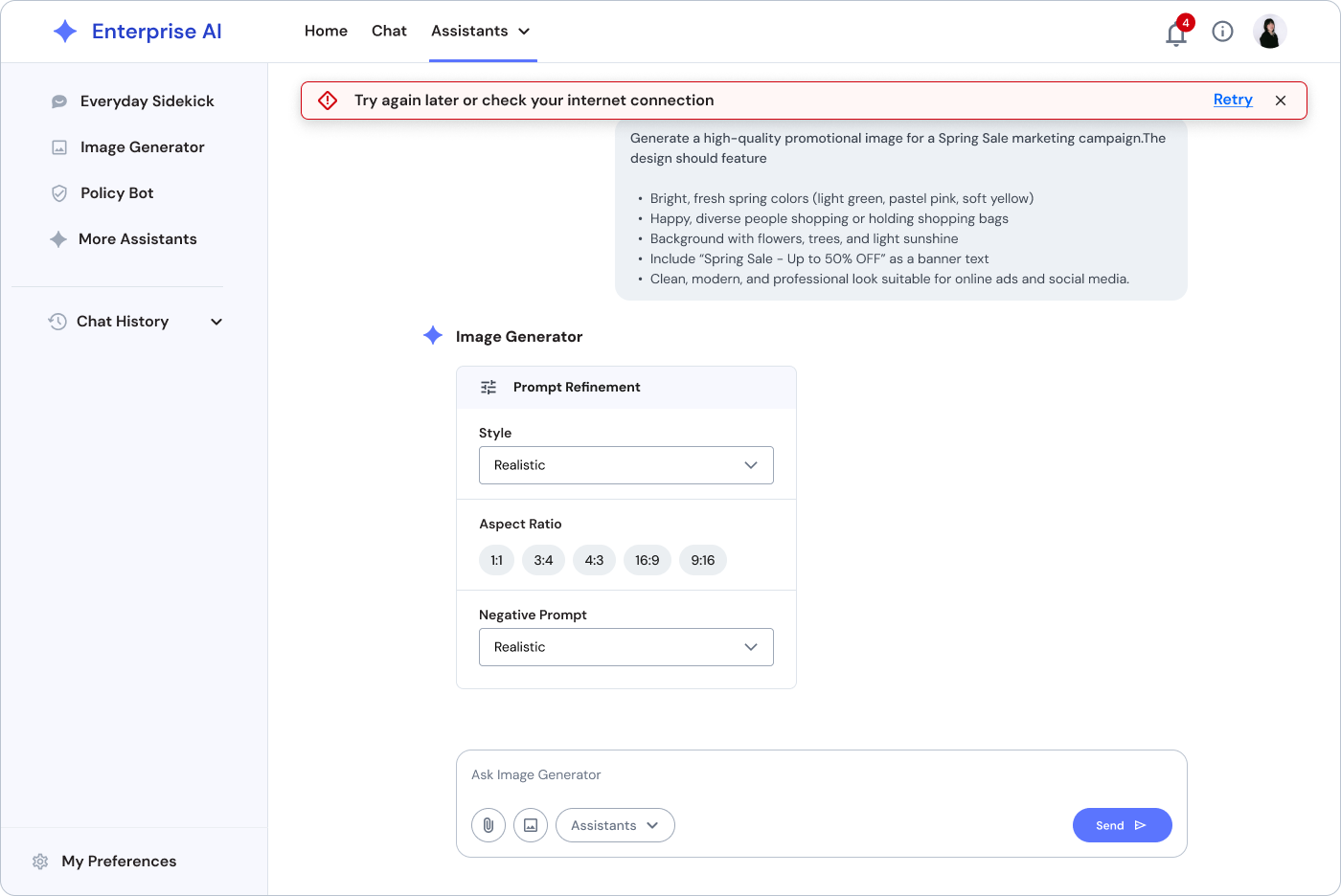
Add a Prompt Refinement panel that allows users to easily select predefined parameters such as style, aspect ratio, and negative prompts. This reduces user effort, minimizes errors, and supports users who may not be familiar with writing detailed prompts.
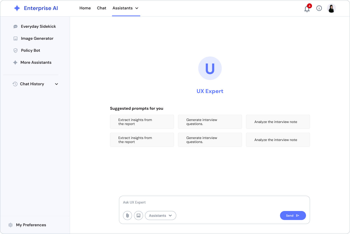
Provide Suggested Prompts for Users: Implement contextual prompts and suggestions in the chat input area based on user interaction patterns and previous queries.
Improve Design Aesthetics: Adopt design system and minimalist approach to ensure consistency across the platform's overall visual language
Summary
01. Create Assistant


Key Findings
No Option for "Save Draft" (Severity 4)
Code Interpreter Difficult to Find (Severity 3)
No Error Messages and Error State (Severity 3)
Confusing Behavior of 'X' Button (Severity 3)
Recommendation
Add a "Save Draft" option or Auto-save
Implement error states for error fields.
Change the behavior of the 'X' button to “Go back” icon to get to the previous page
02. Chat Page
Key Findings
Low Visibility of Upload Icon (Severity 3)
Error Message Not Contextually Placed (Severity 3)
Chat Input Field Lacks Clarity (Severity 3)
Recommendation
Use clearer, more prominent icons for adding or attaching files.
Ensure error messages are contextually placed near the relevant input fields.
Improve the design and visibility of the chat input field .
03. Home Page
Key Findings
Text-heavy homepage increases cognitive load, making key information harder to scan and overwhelming for users. (Severity 3)
Previous chats and assistants are not shown on the landing page, making it hard for users to locate or resume previous work. (Severity 3)
Recommendation
Surface Recent Activity or My Chats directly on the homepage. Show thumbnails or titles of the most recent sessions with options to resume or manage.
Highlight "Create Assistant" with a prominent display and GIF.
Add interactive CTAs to cards

What I Learned
Gained hands-on practice with heuristic evaluations, cognitive walkthroughs, and severity scoring.
Learning to zoom out and see the “big picture” of user needs across different departments.
UX is not only about UI visuals , it’s about uncovering core problems and designing intentional, scalable solutions.
“Stop thinking about just the interface , focus on what users really need.”

Mentorship and UX Team
I want to thank Teressa Clark , my incredible UX manager and mentor, who always pushed me to think deeper.
“Dig deep to uncover the core problems, not just the surface issues.”
You’ve taught me to always ask “Why?” and approach design intentionally, backed by user research. I’ll continue building this skill like a muscle, as you’ve inspired me.
A big thank you to Kevin Justich for your guidance on data analysis and enterprise research.
“To understand the problem, step back and see the entire forest, not just the leaves around you.”
This completely reshaped how I approach UX design evaluation and UX thinking.