Enterprise Design system
Develop a cohesive and scalable enterprise design system for internal software and applications at Colgate-Palmolive. This system serves as a centralized resource for designers, developers, and stakeholders across multiple brands and products, providing standardized components and design tokens that promote consistency, efficiency, and usability across all platforms.
My role
Created 7 core components, 3 enterprise components, applied tokens, and performed QA
Designed atomic components, states, behaviors, and component architecture
Conducted component research and landscape analysis
Conduct moderated usability testing sessions with 8 designers
Analyzed and summarized key findings in a presentation deck
Design System Team
Penny Kasinphila (Me), UX design intern
Teressa Clark, UX Design Manager
Tools
June 2024 – May 2025
Duration
Figma, FigJam

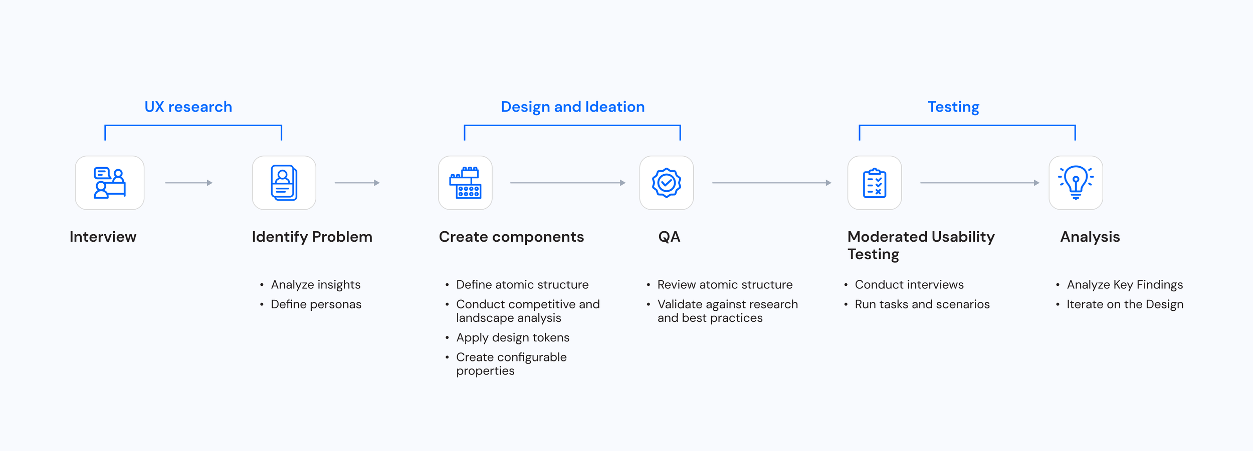
Design Process

Understanding the Problem
“ Across teams at Colgate-Palmolive, we were constantly rebuilding the same components, yet still ending up with inconsistent, inaccessible, and unscalable design.”
“ Every project feels like we’re reinventing the wheel, there’s no centralized way to reuse what we’ve already made.”
Developer
“When designs aren’t consistent, we spend more time redoing work and guessing what’s correct, it slows us down and makes the code harder to maintain.”
Developer
It’s so time-consuming to build a design system from scratch, it takes me away from core UX work, especially when I’m working under tight deadlines or sprint cycles.”
UX Designer
It’s hard to manage all the complexity, every time there’s a tech, accessibility, or branding update, I end up reworking the same component across multiple brands.
UX Designer
Personas

Designers’ need
A centralized, well-documented design system to reduce rework
Confidence in using tested and approved components
Clear guidance on how to apply tokens (colors, spacing, typography)
An onboarding experience that’s easy to follow and not overwhelming
Consistency across files to reduce confusion

Developers’ need
A streamlined setup process for installing and using design system components
Tokens synced directly to code to avoid manual styling
Confidence that components are accessible, tested, and match design
A visual + code reference (e.g., Storybook) to quickly understand properties and variants
Flexibility to customize when needed, without breaking the system
Solution
Created an integrated design system that bridges design and development by providing reusable components, synced design tokens, and clear documentation and best practices.

Empowers designers to work efficiently and consistently across products.

Gives developers a reliable, scalable foundation.

Reducing rework and also improving collaboration
Design System Metaphor
I sketched this metaphor diagram to help me understand what I’m doing. The first image shows a room with furniture coming together to build a living room. The second image shows components or building blocks used to build software and applications.
These examples follow a similar process, beginning with building blocks and a single source of truth to create a scalable structure and efficient process.

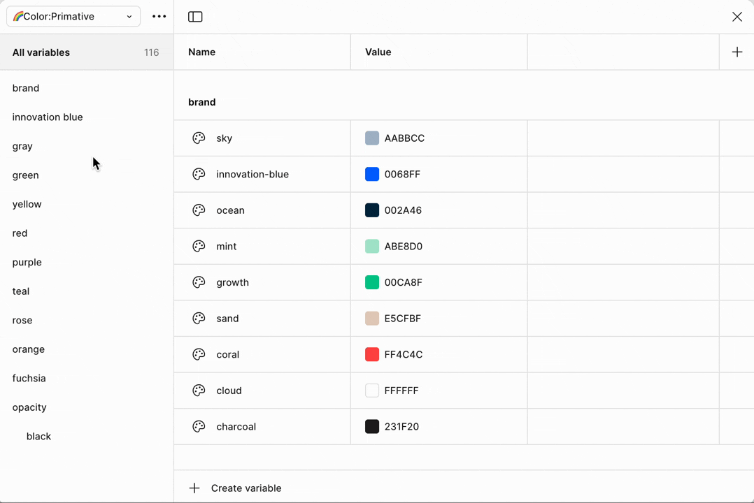
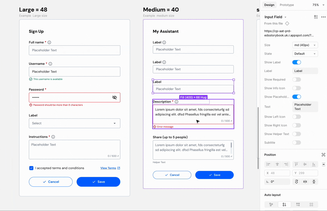
Design Tokens
We use primitive tokens for raw values (e.g., color/innovation blue/600) and semantic tokens for meaningful roles (e.g., color/background/action/primary/default) to ensure consistency and flexibility. To streamline design-to-code handoff, we built an internal plugin that syncs tokens between Figma and VS Code. When we publish the Figma library, the corresponding JSON files in our codebase update automatically.

Cross-Brand Theming with Design Tokens
To streamline collaboration between designers and developers, we propose aligning the token naming system. This will enable future development to easily swap tokens based on brand, especially for direct-to-consumer website experiences across our multi-brand products.
See our brands

Applying Tokens
Applying semantic tokens in Figma as a single source of truth ensures consistency across color, typography, spacing, and borders. By linking components to token variables, we simplify updates, support theming, and keep design and development in sync.


Workflow

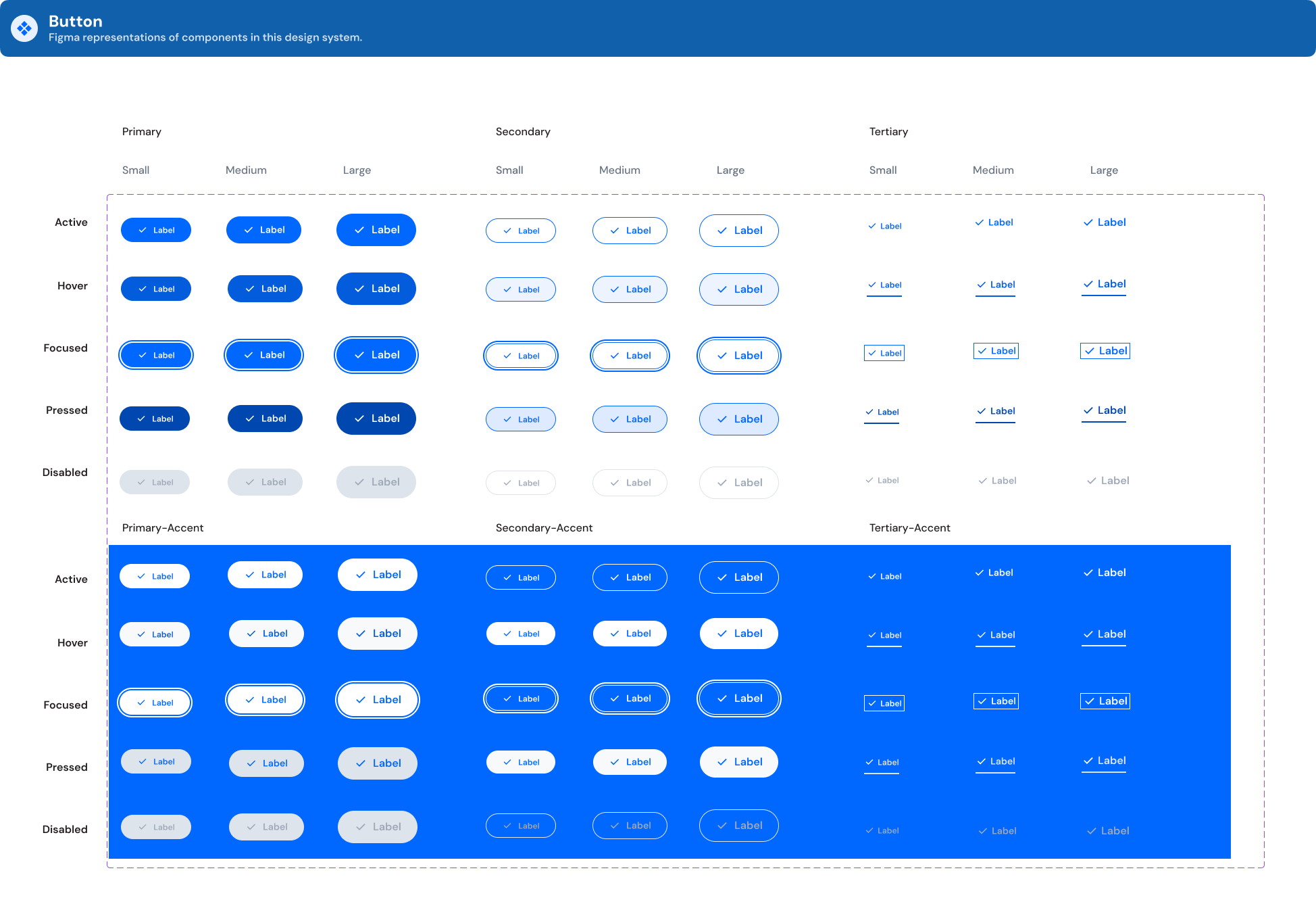
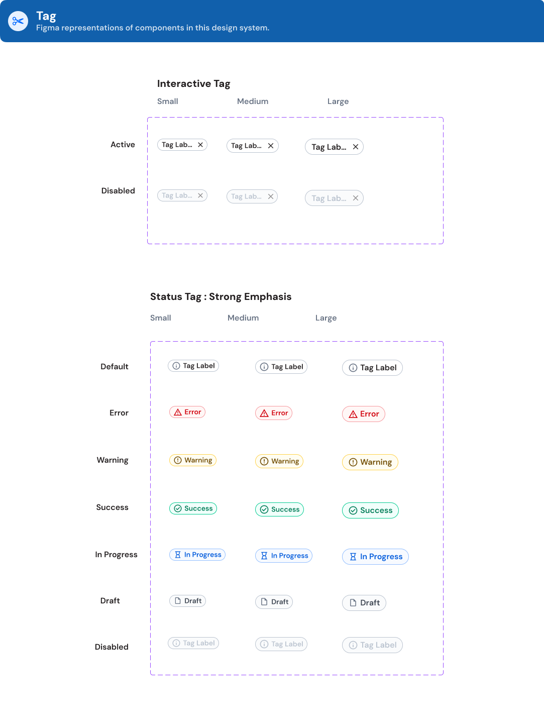
Components We Built


Usability Testing for designers and developers
The purpose
Learn how UX designers and developers expect to import design system library, searching and using components
Watch how designers using components, editing components and applying tokens (color, typography, spacing)
Use this feedback to iterate on developed design system components and onboarding documentation.
Study Methodology
8 CP Designers (GIT/ Global Design, Hills)
7 CP Developers (Enterprise/ Direct-to-customer)
1 hour Qualitative Moderated Usability Test


Tasks and Scenarios
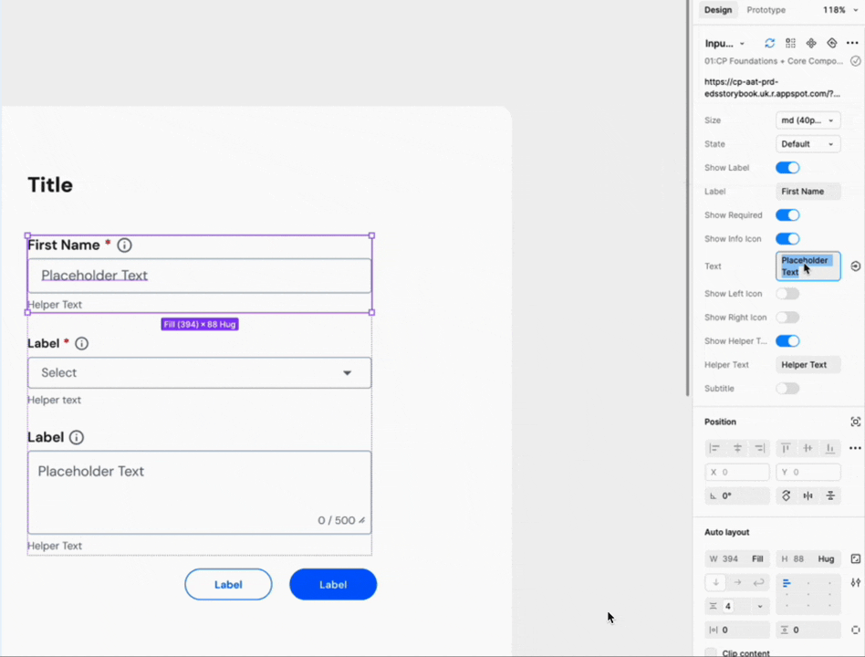
As part of the usability study, designers were asked to complete two tasks: first, import the CP Design System and explore the onboarding docs; second, bring a wireframe to life by recreating two screens using components from the library. These tasks helped assess ease of onboarding, finding components, and applying tokens like color, spacing, and typography.


Analysis

After receiving feedback from my UX manager, Teressa Clark, I learned how to better summarize key findings: begin with what users said and did, then provide context to explain why. Most importantly, avoid jumping to conclusions too quickly.

Key Findings
Overall, most designers found the experience of importing libraries and working with components to be smooth, and intuitive.
It was a straightforward process, from dragging and assembling components to editing component properties.
They saw its value in reducing redundant work and could speed up their project. The well-defined components gave them confidence and helped avoid the need to piece components together component.

Using components
Most users found it easy to edit properties on the right panel, as editable property usage allowed them to avoid manual editing.
Most users appreciated the editable side panel properties, the ease of changing properties, and the editable text property. These gave them the flexibility to work on with their design and helped reduce redundant work.
Onboard Documentation
Although users mentioned that the documentation is structured and easy to scan, some found onboarding documentation overwhelming.
All users generally scanned through multiple sections. Some expected a clearer documentation to distinguish between “what is essential to know” vs. “what is nice to know."

Applying tokens
Most users experienced difficulty in applying tokens. They wanted to see documentation, visual example, and guidance on how to apply tokens such as color, typography, spacing unit, and border radius tokens.
They felt frustrated when they didn’t know how to apply tokens due to having less experience with primitive tokens, semantic tokens and variables, which made them less confident in applying the tokens.

Impact and effort matrix
To prioritize and plan next steps, we used the Impact–Effort Matrix to help identify and define high-impact, low-effort and high-impact, high-effort tasks.

Next Step
Short Term : Low Effort / High Impact
We will focus on enhancing onboarding clarity and token education by providing a file organization overview, educational tutorials, and examples for applying tokens. We’ll also improve component flexibility by adding size variations to top navigation and clearer typography token guidance.

Long Term : High Effort / High Impact
We’ll develop visual templates to support onboarding and design kickstarts, restructure onboarding materials to highlight essential content, and provide detailed guidance for token application, including clarifying naming conventions and expanding key components like cards or containers.

Ref : Lightning Design System , Salesforce
What I Learned
This project gave me hands-on experience across the entire UX design process, from research and usability testing to creating components and documenting design systems.
I learned how powerful moderated usability testing can be, not just in observing what users do, but in understanding why they think and act the way they do. Asking follow-up questions and digging deeper helped me connect behavior with motivation. I realized that what people say and what they do aren’t always the same, and thoughtful listening is key to uncovering real insights.
I learned how to structure atomic components with properties, enabling to toggle options on and off, select variants, and edit properties with flexibility.Thinking holistically about states, behaviors, signifiers, and affordances. It challenged me to not only design for clarity and flexibility, but also to create documentation that supports designers and developers as well.
This experience strengthened my skills in
Design thinking
System-level thinking
Reinforced the value of thoughtful UX research in creating better experiences that actually solve real problems.


Mentorship and UX Team
Having Teressa Clark as both my manager and mentor was an amazing experience. I learned so much from her: UX thinking, analytical thinking, and how to ask the right questions. She helped me set clear goals and guided me in growing in the areas I was most curious about. She planted that UX mindset in me, and it’s been growing ever since. Now, I constantly think about the “why” behind my design decisions. It’s like she helped build my UX instincts without me even realizing it.
I’d also like to thank the amazing UX team for creating such a supportive environment, sharing insights, and always being generous with feedback. Working with this team made the experience even more rewarding.


