
Enterprise AI Platform Design system
Develop a cohesive and scalable design system for internal AI platform. Enterprise AI is an internal AI platform used by multiple departments, such as marketing, product, sales, and data teams, each with different needs, from content generation to data analysis and business optimization.
My role
Created core components, enterprise components, applied tokens, and performed QA
Designed atomic components, states, behaviors, and component architecture
Conducted component research and landscape analysis
Analyzed and summarized key findings in a presentation deck
Design System Team
Penny Kasinphila (Me), UX design intern
Teressa Clark, UX Design Manager
Tools
June 2024 – May 2025
Duration
Figma, FigJam
Design Process

Start by working from a 4px soft grid
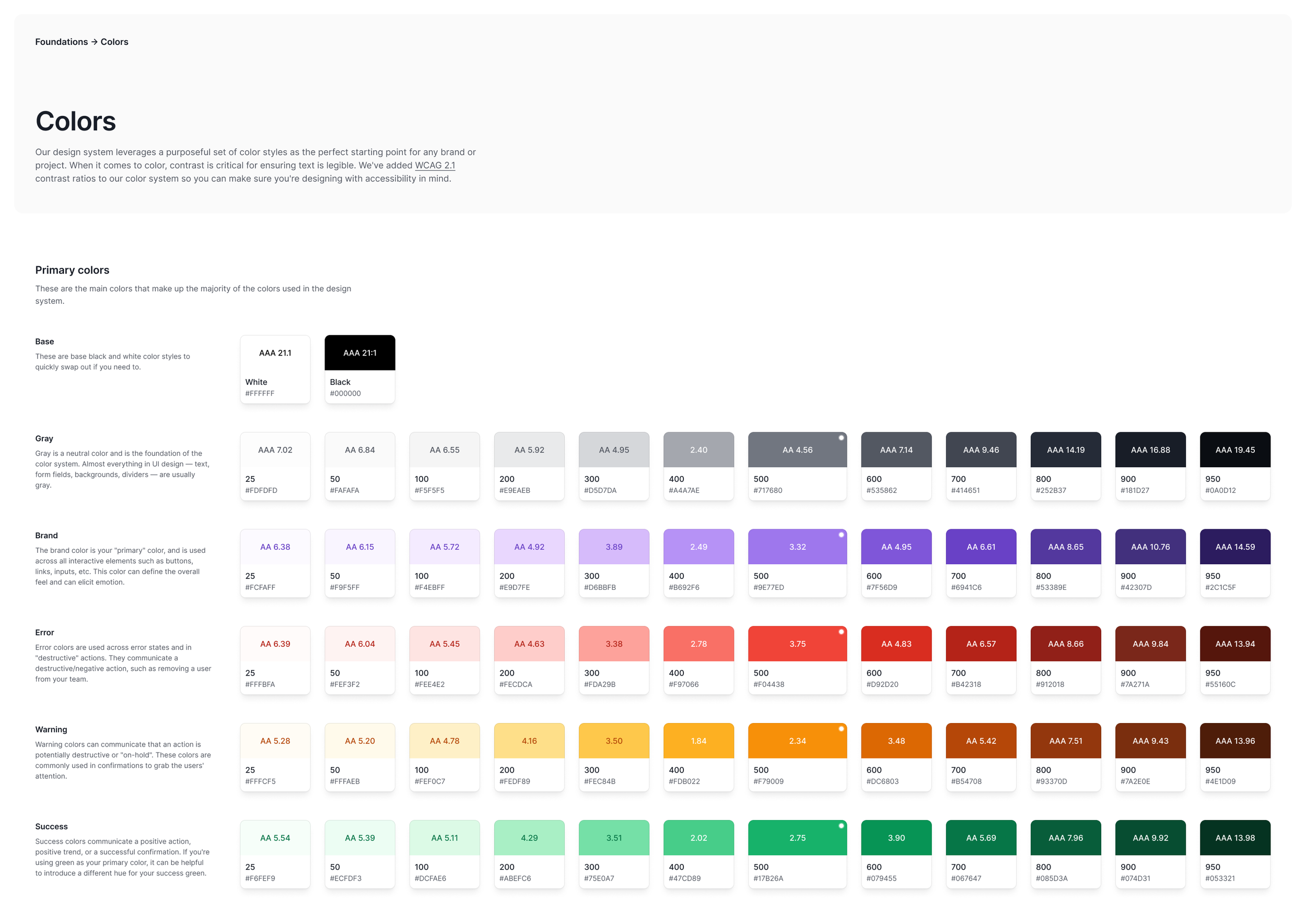
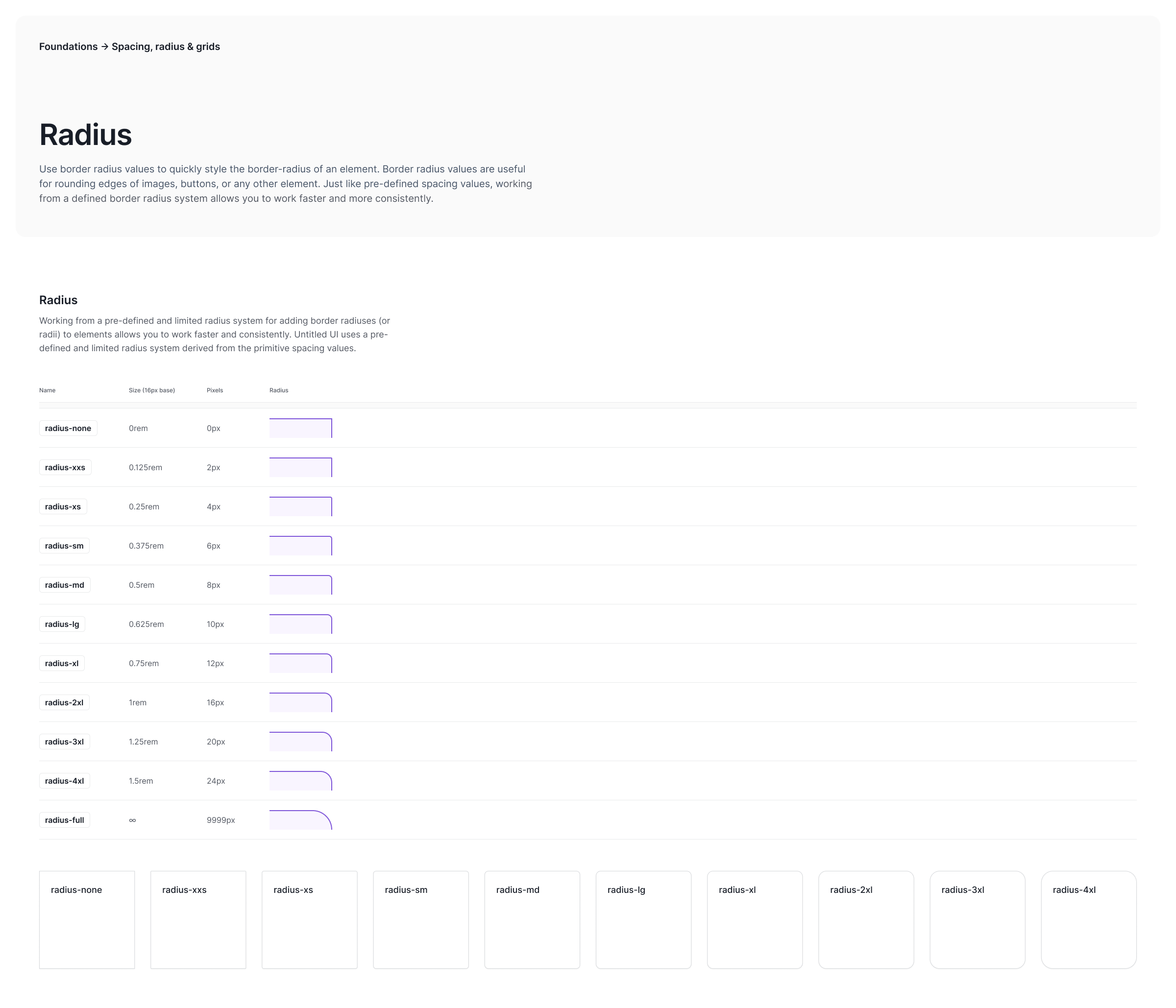
Most modern UI and design systems are built on a grid system foundation. Some of these systems opt for a ‘hard grid’ approach, which boxes elements in the design to a rigid 8px grid. We always opt for a 4px ‘soft grid’ approach, which allows for more nuanced spacing options, while still aligning to an 8px grid. This means every spacing element is divisible by 4.

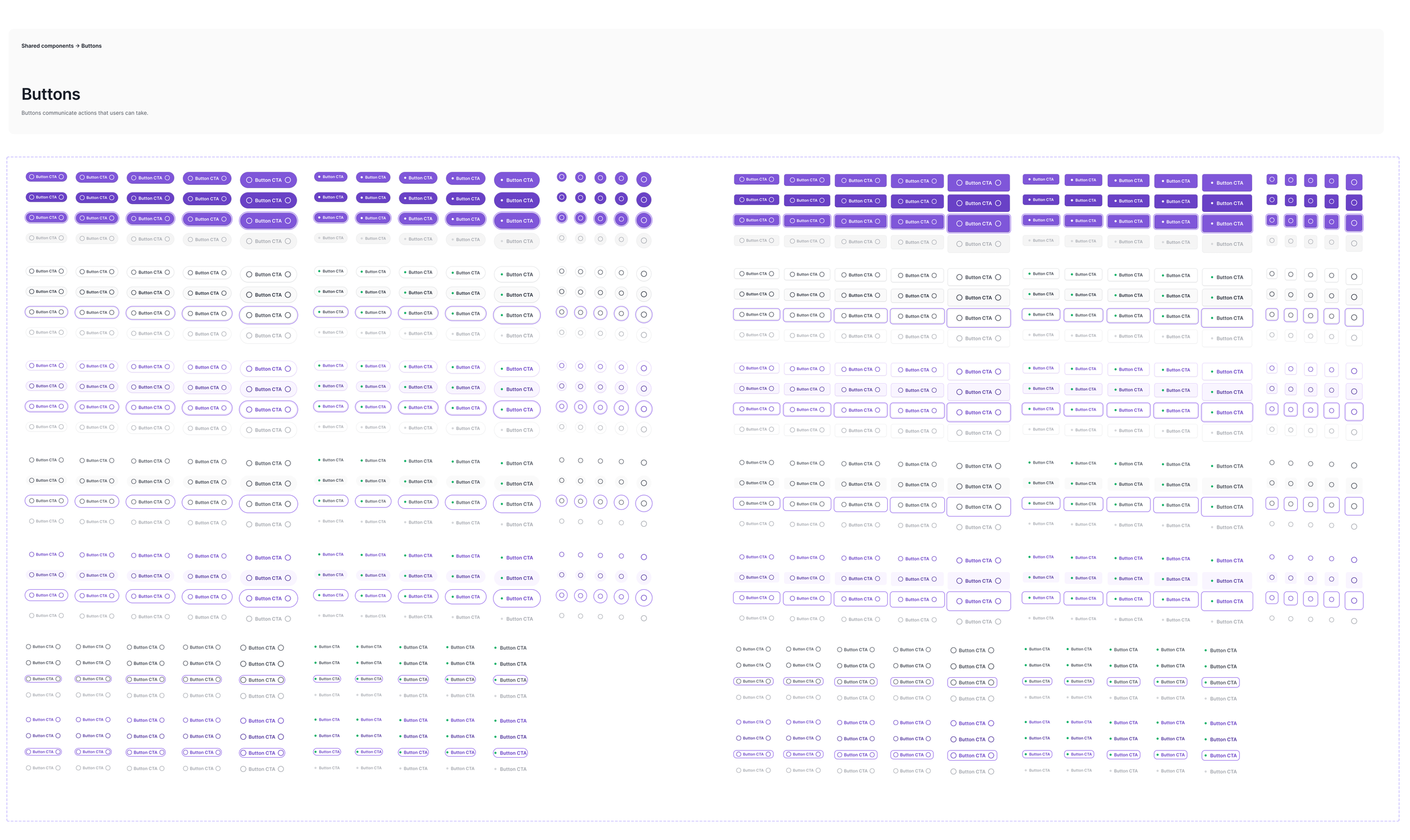
Don’t forget hierarchy
When there are more than one action on a page, it’s important to arrange them in a clear hierarchy. Each action on a page sits somewhere on a hierarchy of importance. Most components and pages have just one “primary” action. This is the main action the user is likely to take (or that the designer wants them to take). Other actions are “secondary”. There may be more than one secondary actions on a page. As a general rule, it’s good to differentiate these and arrange them in a consistent hierarchy if possible. You may even need a third “tertiary” or even fourth “quaternary” action.
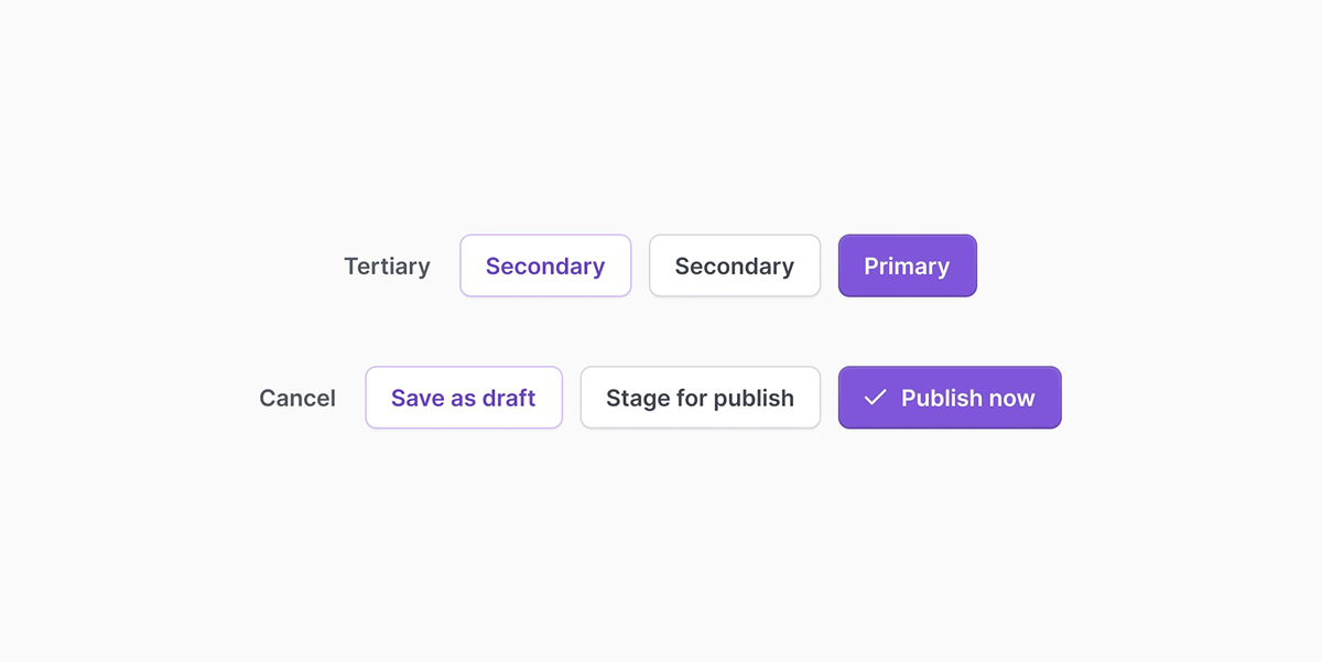

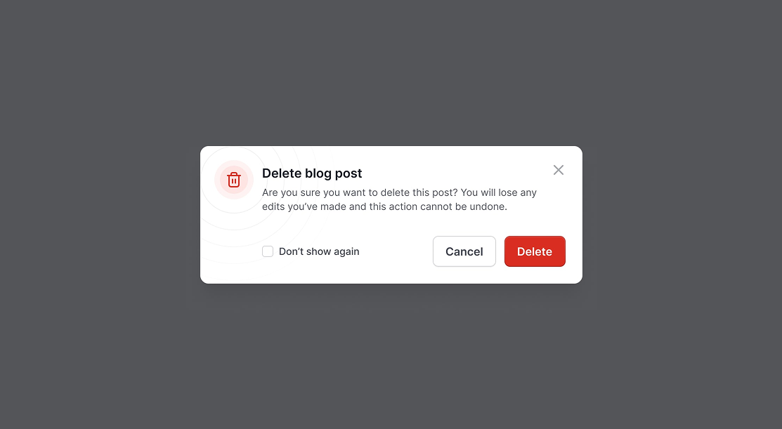
Destructive actions
There's a common notion that all “negative” or “destructive” actions need to be a big red button. In most cases, this is not entirely necessary and can make designs look and feel busy:
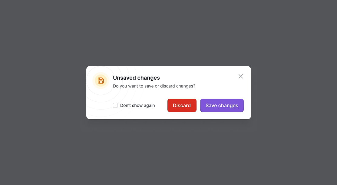
In most cases, a secondary button will do the trick
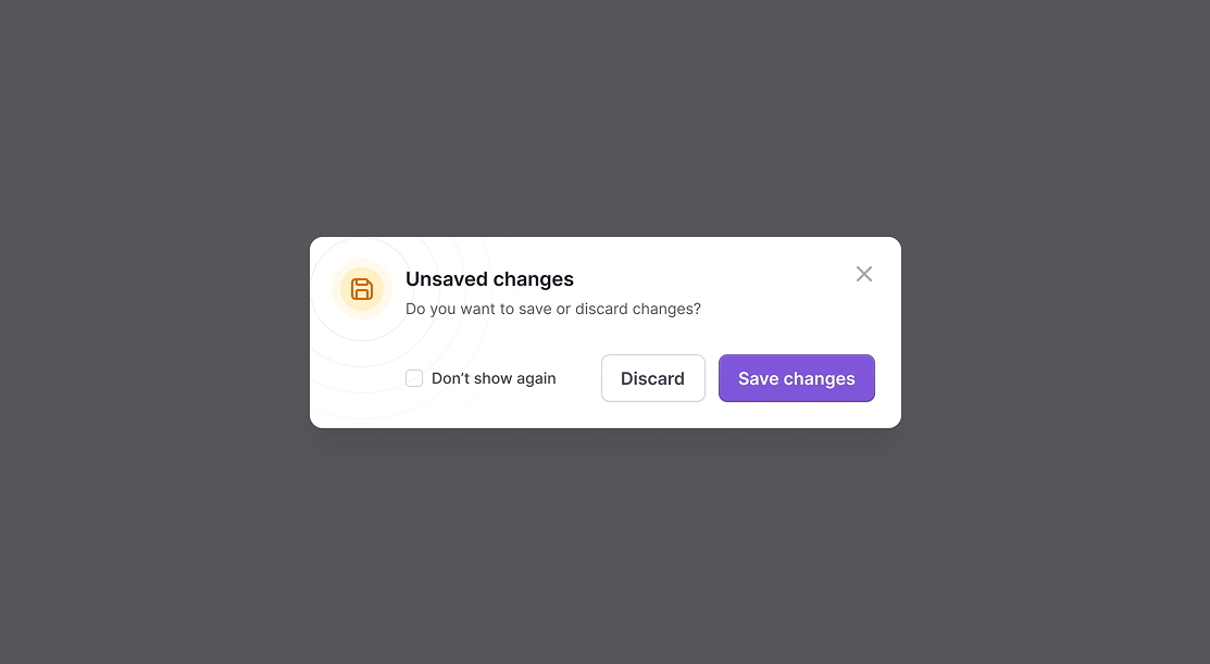
That being said, if a particular destructive action is the primary action, it is usually a good idea to flag this visually with a “destructive” variant of a button. This makes it clear to the user that they are about to take a highly consequential action.
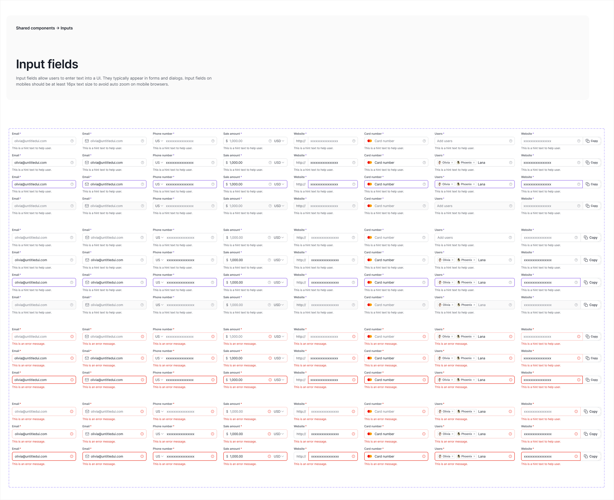
Design Tokens
We use primitive tokens for raw values (e.g., color/innovation blue/600) and semantic tokens for meaningful roles (e.g., color/background/action/primary/default) to ensure consistency and flexibility. To streamline design-to-code handoff, we built an internal plugin that syncs tokens between Figma and VS Code. When we publish the Figma library, the corresponding JSON files in our codebase update automatically.
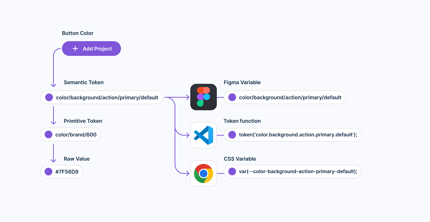
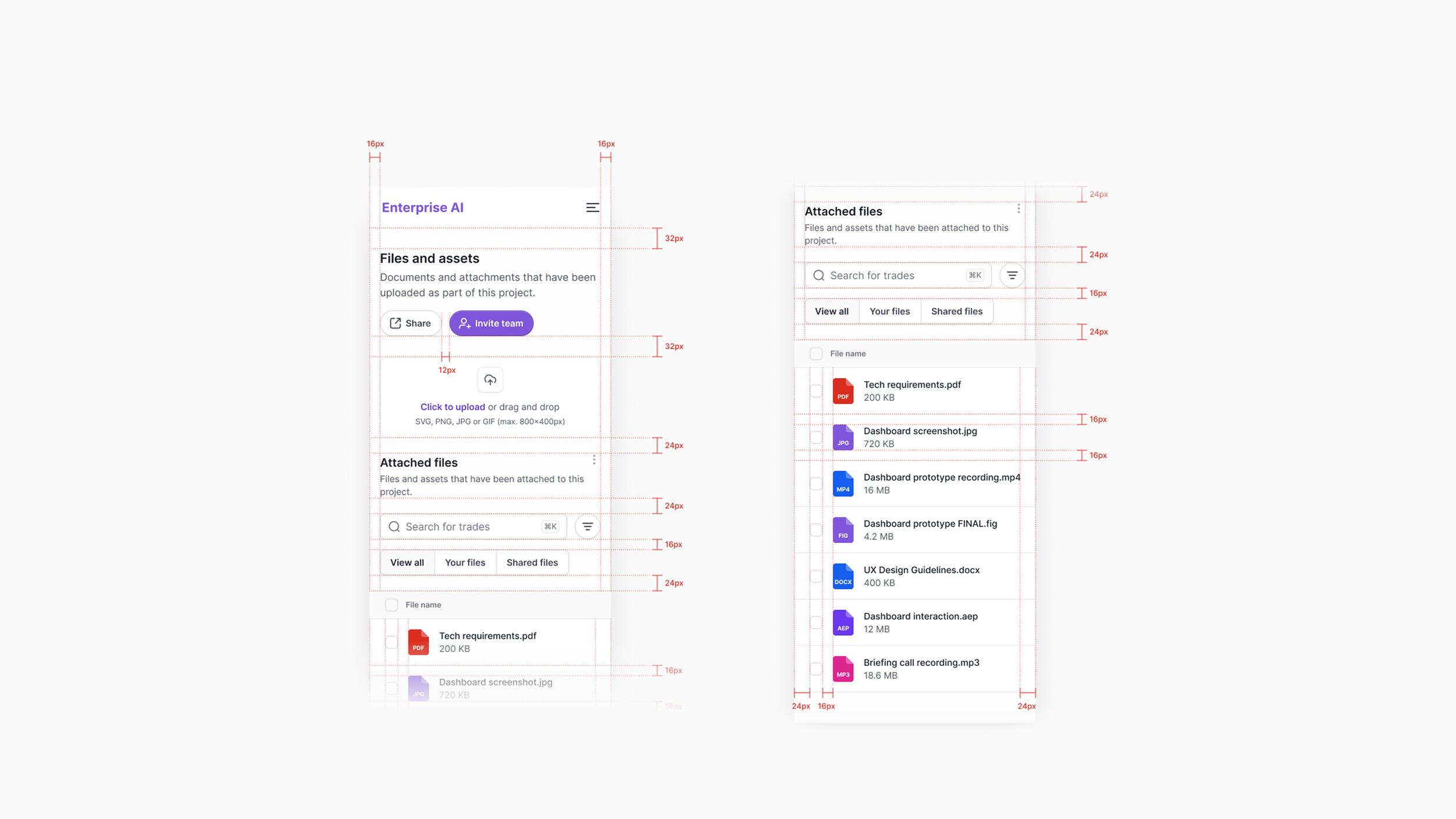
Applied Tokens
Design tokens are the smallest building blocks of a design system—named variables that store design decisions such as color, spacing, typography, and more.These images are showing how design tokens are applied in a design system to ensure consistency across UI components. Here’s a breakdown of what’s happening:
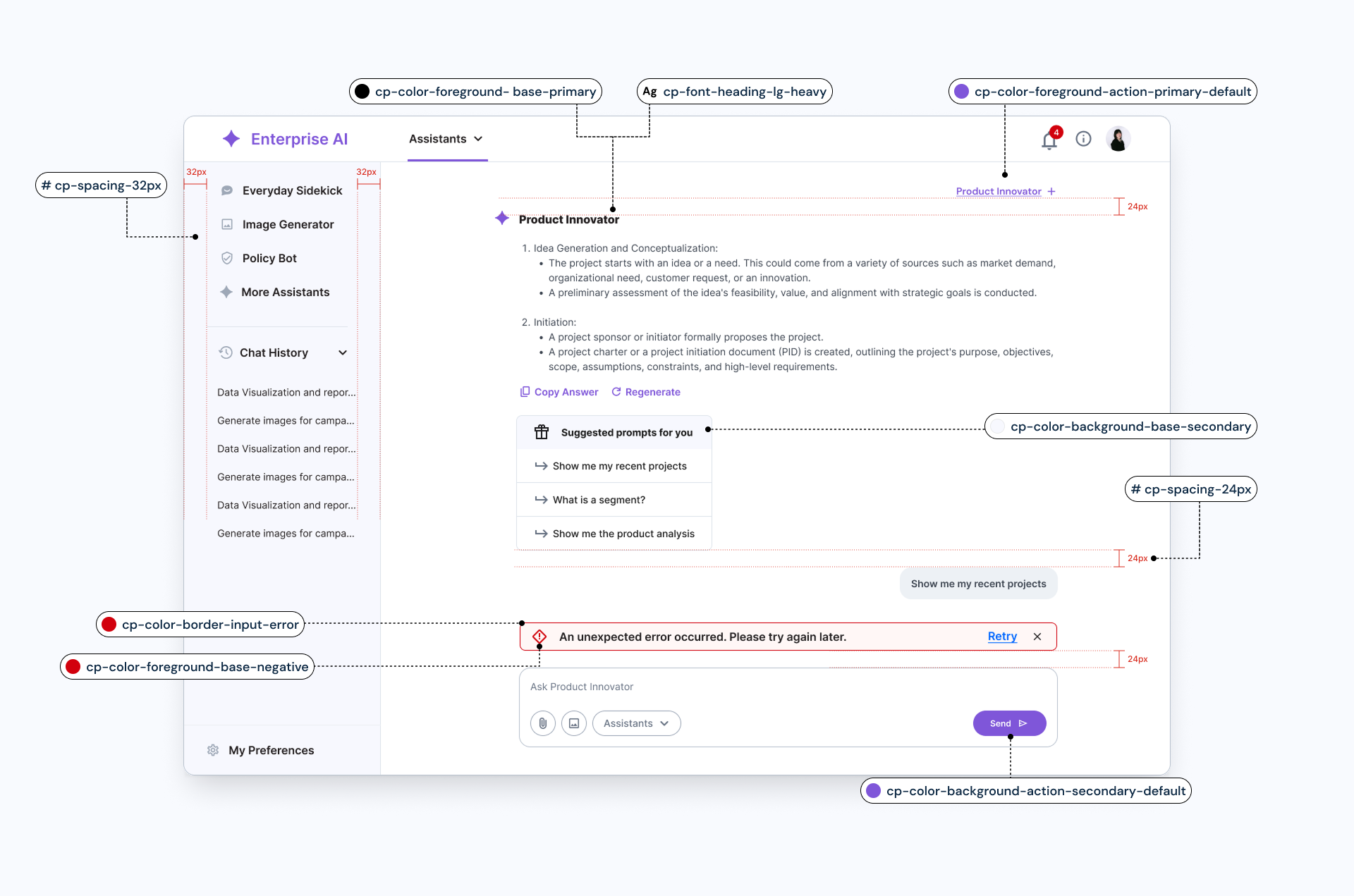
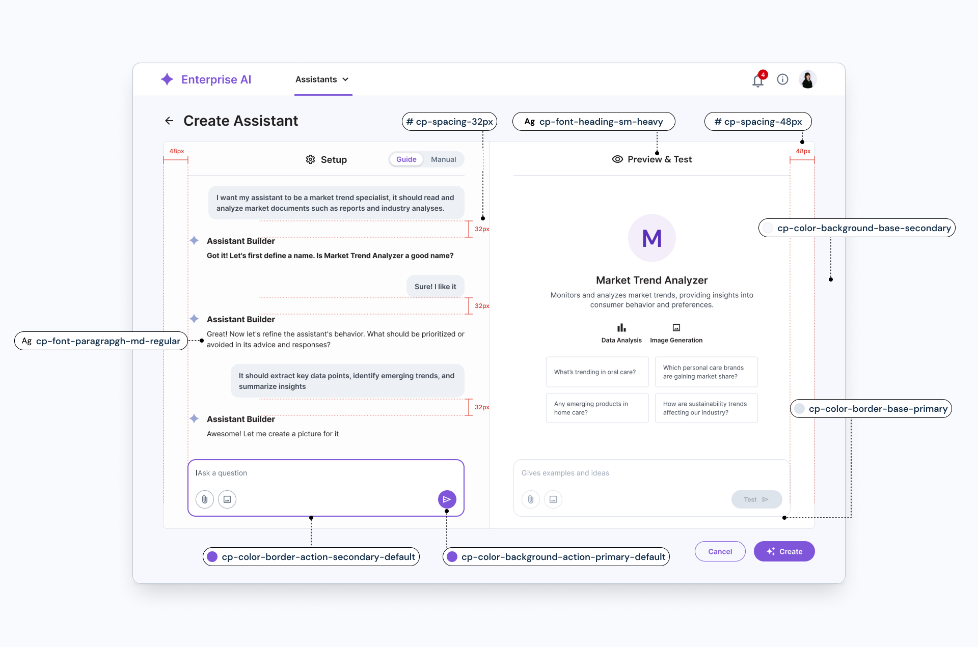
Workflow

Foundation
Components
Next Step
Short Term : Low Effort / High Impact
We will focus on enhancing onboarding clarity and token education by providing a file organization overview, educational tutorials, and examples for applying tokens. We’ll also improve component flexibility by adding size variations to top navigation and clearer typography token guidance.

Long Term : High Effort / High Impact
We’ll develop visual templates to support onboarding and design kickstarts, restructure onboarding materials to highlight essential content, and provide detailed guidance for token application, including clarifying naming conventions and expanding key components like cards or containers.

Ref : Lightning Design System , Salesforce